Time Series Forecasting
Step 01 Introduction
As a data scienst team, we are working with a real estate company in Beijing, China. We have been asked to determine whether sales for the real estate company are incerasing or declining.
This Time Series Forecasting project is another side of the other Beijing housing price project, especially regarding foecasting instead of regression.
Data
The housing price data is succeeded from step 3 in the other project. In addition, we also use some market prices or index to improve forecasting accuracy.
Step 02 Data Wranging
Imports
import warnings
warnings.filterwarnings('ignore')
import pandas as pd
import numpy as np
import os
import matplotlib.pyplot as plt
import seaborn as sns

from sklearn.preprocessing import scale

from library.sb_utils import save_file

%matplotlib inline

# Optional Plotly Method Imports
import plotly
import cufflinks as cf
cf.go_offline()

# These for time series statistics
from statsmodels.tsa.stattools import adfuller,kpss,coint,bds,q_stat,grangercausalitytests,levinson_durbin
from statsmodels.graphics.tsaplots import plot_acf,plot_pacf # for determining (p,q) orders
from statsmodels.tsa.seasonal import seasonal_decompose      # for ETS Plots
from pmdarima import auto_arima                              # for determining ARIMA orders


from statsmodels.tools.eval_measures import rmse
Configuration
# Set the number of display
pd.set_option('display.max_columns', 100)
pd.set_option('display.max_rows', 100)

pd.options.display.float_format = '{:.4f}'.format
Load The Data
df = pd.read_csv('../data/df_data_step3a_EDA.csv',parse_dates = ['tradeTime'])
df_sales = pd.read_csv('../data/time_sales_data_step3a_EDA.csv',index_col='tradeTime',parse_dates = ['tradeTime'],)

df_10yrBond = pd.read_csv('../raw_data/China 10-Year Bond Yield Historical Data.csv',index_col='Date',parse_dates = True)
df_hmi  = pd.read_csv('../raw_data/Real Residential Property Prices for China.csv',index_col='DATE',parse_dates = True)
df_sse  = pd.read_csv('../raw_data/SSE Composite Index (000001.SS) Historical Data - Yahoo Finance.csv',index_col='Date',parse_dates = True)
Clean the data
China 10-Year Bond Yield Historical Data
Data overview
df_10yrBond.head()
There are some unnecessary columns.
Type of index
df_10yrBond.index
Frequency is 'MS'.
Clean data and rename the columns
We use only Date and price of the 10 years bond. Date is monthly freq, so it be renamed.
df_10yrBond.rename(columns={'Price':'10yrBond',},inplace=True)
df_10yrBond.drop(columns=[ 'Open', 'High', 'Low', 'Change %'],inplace=True)
df_10yrBond.index.names=['month']
# df_10yrBond.index.astype('datetime64[ns]')
df_10yrBond.index
Now, we transform the index format to the same one as the tradeTime in the original housing price data.
# https://stackoverflow.com/questions/58490016/convert-mmm-yy-to-date-time-in-python
df_10yrBond.index = pd.to_datetime(df_10yrBond.index,format='%b %y').strftime('20%y-%m-01')
df_10yrBond.index = pd.to_datetime(df_10yrBond.index)
Make a new dataset, called market, to use in the next steps
market = df_10yrBond.copy()

# set index frequency
market.index.freq='MS'

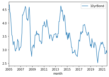
# Visually check the data
market.plot();
China Housing Market Index
Data overview
# Check the data
df_hmi.head()
Rename the columns
# Rename the coluns as hmi, home market index
df_hmi.rename(columns={'QCNR628BIS':'hmi'},inplace=True)
df_hmi.index.names=['quarter']
df_hmi.head()
Add to market dataset
# Add and resent the name
market = pd.concat([market, df_hmi],axis=1)
market.index.names=['MS']
The original hmi has only quater based data. To convert it to mothly data, ffill method in fillna function be applied.
market.hmi = market.hmi.fillna(method='ffill')
market.head()
# Check the graph
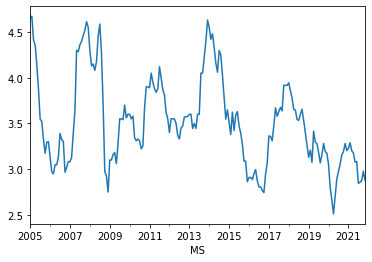
market['10yrBond'].plot();
SSE Composite Index (000001.SS) from Yahoo Finance
SSE (SHANGHAI STOCK EXCHANGE) is one of the major stock index in China.
Data overview
# Check the contents in the SSE data.
df_sse.head()
There are some unnecessary columns, which be removed.
# Drop unnecessary columns
df_sse.drop(columns=[ 'Open', 'High', 'Low','Adj Close', 'Volume'],inplace=True)

# Rename the columns
df_sse.index.names=['month']
df_sse.rename(columns={'Close':'sse'},inplace=True)
df_sse.head()
Add to market dataset
market = pd.concat([market, df_sse],axis=1)
market.head()
market.info();
# Check the graph
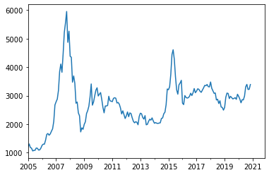
market.sse.plot();
We will smooth this sse in the same way as 10 years bond.
Total Sales data
This is from the file, Regression the step 3 EDA.
Add to market dataset
market = pd.concat([market, df_sales[['totalSales']]],axis=1)
# Check the graph
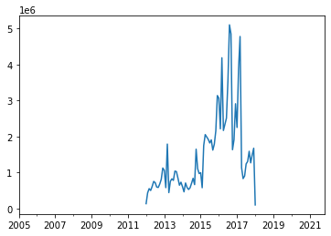
market['totalSales'].plot();
Step 03 Explore The Data
Time series data
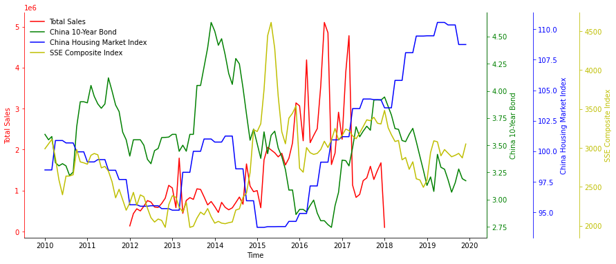
Here, we check visually the relationship between the totalSales and other market prices for the period extended by 2 years, which are from 2010(2012-2) to 2020(2017+2).
# https://stackoverflow.com/questions/20356982/matplotlib-colour-multiple-twinx-axes
def threeTimeSeries(market):

    """
    This is a function to make a gragh showing 1 plus three inconsistent units of time series data.

    """


    fig, host = plt.subplots(
        figsize=(12, 6)
    )
    fig.subplots_adjust(
#         right=0.75
    )

    par1 = host.twinx()
    par2 = host.twinx()
    par3 = host.twinx()

    # move the spine of the second axes outwards
    par2.spines["right"].set_position(("axes", 1.1))
    par3.spines["right"].set_position(("axes", 1.2))


    p1, = host.plot(market.index, market.totalSales, 'r-', label="Total Sales")
    p2, = par1.plot(market.index, market['10yrBond'], 'g-', label="China 10-Year Bond")
    p3, = par2.plot(market.index, market.hmi, 'b-', label="China Housing Market Index")
    p4, = par3.plot(market.index, market['sse'], 'y-', label="SSE Composite Index")

    host.set_xlabel("Time")
    host.set_ylabel("Total Sales")
    par1.set_ylabel("China 10-Year Bond")
    par2.set_ylabel("China Housing Market Index")
    par3.set_ylabel("SSE Composite Index")

#     host.set_xlim(df_10yrBond.index.min(),df_10yrBond.index.max())

    lines = [p1, p2, p3, p4]
    host.legend(lines, [l.get_label() for l in lines],loc='upper left',)

    for ax in [par1, par2, par3]:
        ax.set_frame_on(True)
        ax.patch.set_visible(False)

        plt.setp(ax.spines.values(), visible=False)
        ax.spines["right"].set_visible(True)

    host.yaxis.label.set_color(p1.get_color())
    par1.yaxis.label.set_color(p2.get_color())
    par2.yaxis.label.set_color(p3.get_color())
    par3.yaxis.label.set_color(p4.get_color())

    host.spines["left"].set_edgecolor(p1.get_color())
    par1.spines["right"].set_edgecolor(p2.get_color())
    par2.spines["right"].set_edgecolor(p3.get_color())
    par3.spines["right"].set_edgecolor(p4.get_color())

    host.tick_params(axis='y', colors=p1.get_color())
    par1.tick_params(axis='y', colors=p2.get_color())
    par2.tick_params(axis='y', colors=p3.get_color())
    par3.tick_params(axis='y', colors=p4.get_color())

    host.spines['top'].set_visible(False)

    # host.legend(loc, bbox_to_anchor=(0.6,0.5))

    try:
        # Remove frame color
        frame = host.legend_.get_frame()
        frame.set_facecolor('1.0')
        frame.set_edgecolor('1.0')
    except:
        pass
threeTimeSeries(market.loc['2010-01-01':'2019-12-31'])
There seems to be more correlation between total sales and China 10-year Bond than the others.
Weekly Seasonal Decomposition
Here, we check the trend and seasonality of original total sales data, which is not yet smoothed as above.
# Import necessary libraries
from statsmodels.tsa.seasonal import seasonal_decompose

def plotseasonal(col):

    fig, axes = plt.subplots(ncols=1, nrows=4, sharex=True, figsize=(12,5))
    res = seasonal_decompose(df_sales[col].dropna())
    res.observed.plot(ax=axes[0], legend=False)
    axes[0].set_ylabel('Observed')
    res.trend.plot(ax=axes[1], legend=False)
    axes[1].set_ylabel('Trend')
    res.seasonal.plot(ax=axes[2], legend=False)
    axes[2].set_ylabel('Seasonal')
    res.resid.plot(ax=axes[3], legend=False)
    axes[3].set_ylabel('Residual')
    plt.tight_layout()
    plt.show()
from IPython import display
from ipywidgets import interact, widgets

interact(plotseasonal,
         col=widgets.ToggleButtons(
             options=list(df_sales.columns),
             value='totalSales',
             description='district:',
             disabled=False,
             button_style='', # 'success', 'info', 'warning', 'danger' or ''
            )
        );
There are trend adn seasonality are found.
Tests for Stationarity
We use Augmented Dickey-Fuller Test
from statsmodels.tsa.stattools import adfuller

def adf_test(series,title=''):
    """
    Pass in a time series and an optional title
    Returns an ADF report
    """
    print(f'Augmented Dickey-Fuller Test: {title}')
    result = adfuller(series.dropna(),autolag='AIC') # .dropna() handles differenced data

    labels = ['ADF test statistic','p-value','# lags used','# observations']
    out = pd.Series(result[0:4],index=labels)

    for key,val in result[4].items():
        out[f'critical value ({key})']=val

    print(out.to_string())          # .to_string() removes the line "dtype: float64"

    if result[1] <= 0.05:
        print("Strong evidence against the null hypothesis")
        print("Reject the null hypothesis")
        print("Data has no unit root and is stationary")
    else:
        print("Weak evidence against the null hypothesis")
        print("Fail to reject the null hypothesis")
        print("Data has a unit root and is non-stationary")

# refer to www.pieriandata.com
adf_test(market['totalSales'].dropna(),title='Augmented Dickey-Fuller Test on totalSales Data')
adf_test(market['totalSales'].diff().dropna(),title='Augmented Dickey-Fuller Test on totalSales Data')
One differenciation makes the stationality better.
adf_test(market['totalSales'].diff().diff().dropna(),title='Augmented Dickey-Fuller Test on totalSales Data')
Two differentiation does not necessarily make it better. Therefore, we will use one differenciation in the further modeling.
Change %
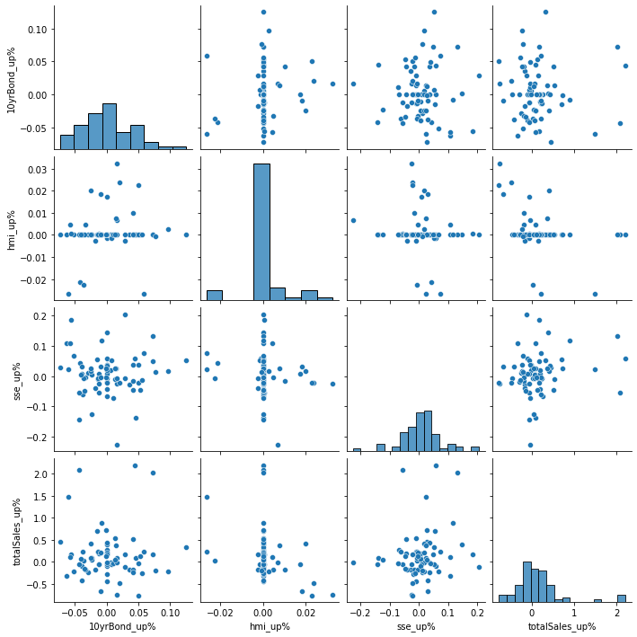
We use pandas pct_change() method on each column to create a column representing the increase(up) in each market value compared to previous month. The unit is percentage %.
pC = pd.DataFrame()
pC.index.names = ['MS']

for c in market.columns:
    pC[c+'_up%'] = market[c].pct_change()
pC.head()
Time Series - Feature Correlation
Here, we check the correlation of feature values and target value(totalSales).
Firstly, we maerge all data into a data set.
sns.pairplot(pC.loc['2012-01-01':'2017-12-31']);
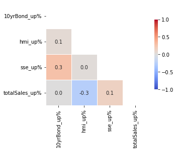
Create a heat map
# Make a function to create a correlations map
def correlations(df,targetLabel,ncol=None,fs=(12,6)):


    if ncol is None:
        ncol = 1
    nrow = 1

    f, ax = plt.subplots(nrow,ncol,figsize=fs)

    c = list(df.columns)
    c.remove(targetLabel)
    c.append(targetLabel)

    # Compute the correlation matrix
    corr = df[c].corr()

    # Generate a mask for the upper triangle
    mask = np.triu(np.ones_like(corr, dtype=bool))

    # Draw the heatmap with the mask and correct aspect ratio
    sns.heatmap(corr, mask=mask, cmap='coolwarm', vmax=1, vmin=-1, center=0,
                square=True, linewidths=.5, cbar_kws={"shrink": .5},
                annot=True,
                fmt=".1f",
                ax=ax
               )
    plt.tight_layout();
correlations(pC,'totalSales_up%',fs=(5,5));
With regards to totalSales_up%, weak pairwise correlation of the percent changes are found in hmi and sse.
Correlation map By Year
In Regression Step 03 EDA, we have already explored the pairwise correlation of columns in the original housing price data(df).
Here, we explore in the same way, but with addional information of following three increase in market values.
- '10yrBondSmul12_up%'
- 'hmi_up%'
- 'sseSmul12_up%'
df['MS']=pd.to_datetime(df.tradeTime,format='%Y-%m-%dd').dt.strftime('%Y-%m-01').astype(str)
pC = pC.reset_index()
pC.MS = pC.MS.astype(str)
df = df.merge(pC.drop(columns=['totalSales_up%']),how='left',on='MS')
df.drop(columns=['MS'],inplace=True)
mask_df = (df.tradeTime>='2015-01-01') & (df.tradeTime<='2017-12-31')
# Make a list, c, to put price in the last
def mapCorrelationsByYear(df, ncol=None, figsize=(15, 8)):
    """
    Input dataframe as df.
    Return triangular shape corr map By Year

    """

    f, axes = plt.subplots(1,len(df.year.unique()),figsize=(11*len(df.year.unique()), 9*len(df.year.unique())))

    for i, year in enumerate(df.year.unique()):

        if ncol is None:
            ncol = 1
        nrow = 1

        temp=df[df.year==year].drop(columns='year')

        c = list(temp.columns)
        c.remove('price')
        c.append('price')

        # Compute the correlation matrix
        corr = temp[c].corr()

        # Generate a mask for the upper triangle
        mask = np.triu(np.ones_like(corr, dtype=bool))

        # Draw the heatmap with the mask and correct aspect ratio
        sns.heatmap(corr, mask=mask, cmap='coolwarm', vmax=1, vmin=-1, center=0,
                    square=True, linewidths=.5, cbar_kws={"shrink": .1},
                    annot=True,
                    fmt=".1f",
                    ax=axes[i]
                   )
        axes[i].set(title='year= '+str(year))

    plt.tight_layout();
mapCorrelationsByYear(df, ncol=None, figsize=(15, 8))
This is slightly hard to compare to see how each feature values affect price. Next, we just focus on the correlations with price.
Corelation bar By Year
def makeTrans(df):
    """
    Input dataframe
    Return a new dataframe used to make 'Corelation bar By Year'.
    """
    for i,year in enumerate(df.year.unique()):
        temp=df[df.year==year].drop(columns='year').corr()
        if i==0:
            corrs = pd.DataFrame(columns=list(temp.columns))
            corrs.loc[year]=temp['price']
        else:
            corrs.loc[year]=temp['price']
    corrs.drop('price',axis=1,inplace=True)
    trans = corrs.T
    trans = trans.reset_index().rename(columns={'index':'features'}).melt('features', var_name='year')
    return trans
trans = makeTrans(df)
# https://github.com/jbmouret/matplotlib_for_papers/blob/master/src/plot_variance_matplotlib_white.py
def clean_layout(ax):

    """
    This function is only to make layout as cleaner as possible
    """
#     # Delete unnecessary lines
#     ax.spines['top'].set_visible(False)
#     ax.spines['right'].set_visible(False)
#     ax.spines['left'].set_visible(False)

    try:
        # Remove frame color
        frame = ax.legend_.get_frame()
        frame.set_facecolor('1.0')
        frame.set_edgecolor('1.0')
    except:
        pass

    # y axis grid line
    ax.grid(axis='y', color="0.9", linestyle='-', linewidth=1)
    ax.set_axisbelow(True)
def barCorrelationsByYear(trans):

    """
    Input dataframe as df
    Return bar corr map By Year

    """

    fig, ax = plt.subplots(1,1,figsize=(6,36))
    ax = sns.barplot(data=trans, x="value", hue="year", y="features", palette="Blues");

    rects = ax.patches

    # Make some labels
    labels = [f"label{i}" for i in range(len(rects))]

    # For each bar: Place a label
    for rect in rects:

        # Get X and Y placement of label from rect.
        x_value = rect.get_width()
        y_value = rect.get_y() + rect.get_height() / 2


        # Number of points between bar and label. Change to your liking.
        space = 5
        # Vertical alignment for positive values
        ha = 'left'

        # If value of bar is negative: Place label left of bar
        if x_value < 0:
            # Invert space to place label to the left
            space *= -1
            # Horizontally align label at right
            ha = 'right'

        # Use X value as label and format number with one decimal place
        label = "{:.2f}".format(x_value)

        # Create annotation
        plt.annotate(
            label,                      # Use `label` as label
            (x_value, y_value),         # Place label at end of the bar
            xytext=(space, 0),          # Horizontally shift label by `space`
            textcoords="offset points", # Interpret `xytext` as offset in points
            va='center',                # Vertically center label
            ha=ha)                      # Horizontally align label differently for
                                        # positive and negative values.

#     clean_layout(ax)
    ax.grid(axis='y')
barCorrelationsByYear(trans)
This simple corelation coefficients manifests following relationships.
- Subway has the most strong positive relationship with price among the features.
- constructionTime shows the most negative strong, meaning that the newer house has the lower price (totalPrice/square). ...showing some democracy
** totalPrice is exclueded here as it equals to square times price.
Useful data for forecasting
In oredr to find another useful data to improve forecasting, we perform Granger causality test.
The candidates are sse, bond, and hmi.
The function takes in a 2D [y(first column),x(second column)] and a maximum number of lags to test on x.
With regards to the two series, 𝑦 and 𝑥 , the null hypothesis is that lagged values of 𝑥 do not explain variations in 𝑦 .
totalSales vs 10yrBond
# Here y is set as 'totalSales', and x is set as '10yrBond' which is tested to be lagged.
grangercausalitytests(market[['totalSales','10yrBond']].loc['2012-01-01':'2017-12-31'].dropna(),maxlag=12);
Granger Causality shows that 1 month lag denies the null hypothesis. So, we can not refuse that 10yrBond explains variations in totalSales upto 2 months.
totalSales vs hmi
grangercausalitytests(market[['totalSales','hmi']].loc['2012-01-01':'2017-12-31'].dropna(),maxlag=12);
As for hmi (home market index), there seems to be no causual relationship between 'totalSales' and 'hmi'.
totalSales vs sse
grangercausalitytests(market[['totalSales','sse']].loc['2012-01-01':'2017-12-31'].dropna(),maxlag=12);
As for sse(stock price), it is 8 months lag that it is the most loikely that Granger Causality denies the null hypothesis. Therefore, we can not refuse that sse explains variations in totalSales.
Among the three, we choose 10 yr bond as the most related feature to sales.
Step 04 Preprocessing and training
Split the data into train/test sets¶¶
data = market[['totalSales','10yrBond']].loc['2015-01-01':'2017-12-31']

y = data['totalSales']
exog1 = data['10yrBond']
# len(y),len(exog1)


# This is for Facebook's Prophet.
df_prophet = data[['totalSales']]
df_prophet.reset_index(inplace=True)
df_prophet.columns = ['ds','y']

# Define the split line between train and test data
split=int(len(data) * 0.8)

# Make train and test variables, with 'train, test'
data_train, data_test = data.iloc[:split], data.iloc[split:]
y_train, y_test = y.iloc[:split].to_frame(), y.iloc[split:].to_frame()
Forecast using only time series data
Run pmdarima.auto_arima to obtain recommended orders
# For SARIMA Orders we set seasonal=True and pass in an m value

auto_arima(y,
           seasonal=True,
           trace=True,
           error_action='ignore',
           suppress_warnings=True,
          ).summary()
SARIMA model
To make a time-series forecast, firstly we set some parameters necessary for the forecast.
# Load specific forecasting tools
from statsmodels.tsa.statespace.sarimax import SARIMAX
from sklearn.metrics import mean_squared_error
from itertools import product

# Make a function called evaluate_sarimax_model
def evaluate_sarimax_model(data, order,seasonal_order, exog=None):
    """
    Input dataframe as data
    and order and seasonal_order to be used in the SARIMAX

    Return error_mse,error_rmse, y_test, f(forecast on y_test)
    """


    # Needs to be an integer because it is later used as an index.
    split=int(len(data) * 0.8)

    # Make train and test variables, with 'train, test'
    y_train, y_test = data.iloc[:split], data.iloc[split:]
    past=[x for x in y_train]


    try:
        exog_train, exog_test = exog.iloc[:split], exog.iloc[split:]
        e=exog_test[0]
    except:
        exog_train, exog_test,e=None,None,None

    try:
        exog_forecast = exog_test.to_frame()
        past_exog = [x for x in exog_train]
    except:
        exog_forecast=None
        past_exog=None


    # make predictions
    f = list()

    for i in range(len(y_test)):#timestep-wise comparison between test data and one-step prediction ARIMA model.
        model = SARIMAX(past,order=order,seasonal_order=seasonal_order,exog=past_exog,
#                     enforce_invertibility=False,
                   )

        model_fit = model.fit(disp=0)
        future = model_fit.forecast(exog=e)[0]
        f.append(future)
        past.append(y_test[i])
        if past_exog!=None:
            past_exog.append(exog_test[i])
            e=exog_test[i]


    # calculate out of sample error
    error_mse = mean_squared_error(y_test, f)
    error_rmse = rmse(y_test, f)

    # Return the error
    return [error_mse,error_rmse, y_test, f]
error_mse, error_rmse, test, f = evaluate_sarimax_model(y,(0,0,1),(0,0,1,12), exog=None)
print('error_mse %.5e, error_rmse %.0f'% (error_mse, error_rmse))
ModelComparison = pd.DataFrame([{'Model name':'SARIMA with auto_arima',
                                'MAE':error_mse,
                                'Best para':'(0,0,1),(0,0,1,12)',
                                }
                                ])
ModelComparison
Compare predictions to expected values
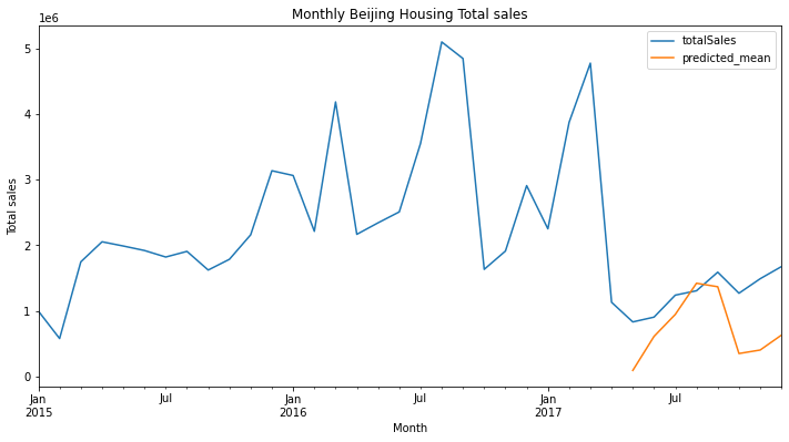
Visualize the results.
# Plot predictions against known values
title ='Monthly Beijing Housing Total sales'
ylabel='Total sales'
xlabel='Month'

# Refit the model
model = SARIMAX(y_train, order=(0,0,1),seasonal_order=(0,0,1,12))
model_fit = model.fit(disp=0)
predictions = model_fit.forecast(len(y_test))


# ax = market['totalSales'].loc['2015-01-01':'2017-12-31'].plot(legend=True,figsize=(12,6),title=title)
ax = y.plot(legend=True,figsize=(12,6),title=title)
predictions.plot(legend=True)
ax.autoscale(axis='x',tight=True)
ax.set(xlabel=xlabel, ylabel=ylabel);
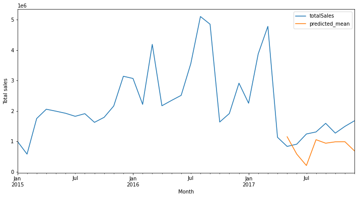
This is the result based on the parameters advised by the auto_arima, and we use this as base model.
Step 05 Modeling
SARIMA with Grid Search for different p, d, and q values.
I have tried making use of gridsearcv function, but it kept causing error, so here we do manually with for loops.
# Make a function to evaluate different ARIMA models with several different p, d, and q values.

def evaluate_models(y, p_values, d_values, q_values, P_values,D_values,Q_values, m_values,exog=None):
    best_score, best_odrder, best_sesonal_order = float("inf"), None, None
    grid_search = pd.DataFrame(columns=['p','d','q','P','D','Q','m','mse','rmse'])
    # Iterate through p_values
    for p in p_values:
        # Iterate through d_values
        for d in d_values:
            # Iterate through q_values
            for q in q_values:

                for P in P_values:

                    for D in D_values:

                        for Q in Q_values:

                            for m in m_values:

                                # p, d, q iterator variables in that order
                                order = (p,d,q)

                                seasonal_order = (P,D,Q,m)
#                                 print('==Now working on order%s,seasonal_order%s==' % (order,seasonal_order))
                                mse,rmse=None,None
                                ps=[p,d,q,P,D,Q,m,mse,rmse]
                                params = {'p':p, 'd':d, 'q':q, 'P':P, 'D':D, 'Q':Q, 'm':m, 'mse':mse,'rmse':rmse}
                                try:
                                    # Make a variable called mse for the Mean squared error
                                    mse,rmse = evaluate_sarimax_model(y, order, seasonal_order,exog=exog)[:2]
                                    grid_search = grid_search.append(pd.Series(ps, index = grid_search.columns), ignore_index=True)
                                    if mse < best_score:
                                        best_score, best_odrder, best_sesonal_order = mse, order, seasonal_order
#                                     print('SARIMAX %s,%s \t\tMSE=%.3f' % (order,seasonal_order,mse))
                                except:
                                    continue
#                                     print('MSE=%.3f RMSE=%.3f' % (mse,rmse))


    print(grid_search.dropna().sort_values('mse').head(1))
    print('Best SARIMAX %s %s MSE=%.3f' % (best_odrder, best_sesonal_order, best_score))
    return [best_odrder, best_sesonal_order, best_score]
p_values = [x for x in range(0, 3)]
d_values = [x for x in range(0, 3)]
q_values = [x for x in range(0, 3)]
P_values = [x for x in range(0, 3)]
D_values = [x for x in range(0, 3)]
Q_values = [x for x in range(0, 3)]
m_values = [3,4,6,12]
import json

try:

    with open("../data/sarima.json", 'r') as f:
        best_odrder1, best_sesonal_order1, best_score1 = json.load(f)
except:

    import warnings
    warnings.filterwarnings("ignore")

    best_odrder1, best_sesonal_order1, best_score1 = evaluate_models(y, p_values, d_values, q_values, P_values,D_values,Q_values, m_values)

    with open("../data/sarima.json", 'w') as f:
        # indent=2 is not needed but makes the file human-readable
        json.dump( [best_odrder1, best_sesonal_order1, best_score1], f)
print('According to this grid search, \
the best model parameter is SARIMAX %s %s and MSE is %.5e'\
       % (best_odrder1, best_sesonal_order1, best_score1))
# Add the metrics to the ModelComparison
def addModel(df1,name,best_score,Best_para):
    # Set a variable for Best para

    df2=pd.DataFrame([{'Model name':str(name),
                        'mse':best_score,
#                         'RMSE':np.sqrt(mean_squared_error(y_test,predictions)),
#                         'Explained_variance_score':explained_variance_score(y_test,predictions),
                        'Best para': Best_para,
                      }
                    ])
    return pd.concat([df1,df2],axis=0)
ModelComparison = addModel(ModelComparison,'SARIMA with Grid Search',best_score1,str(best_odrder1)+','+str(best_sesonal_order1))
ModelComparison
# Plot predictions against known values
title =''
ylabel='Total sales'
xlabel='Month'

# Refit the model
model = SARIMAX(y_train, order=best_odrder1,seasonal_order=best_sesonal_order1)
model_fit = model.fit(disp=0)
predictions = model_fit.forecast(len(y_test))


# ax = market['totalSales'].loc['2015-01-01':'2017-12-31'].plot(legend=True,figsize=(12,6),title=title)
ax = y.plot(legend=True,figsize=(12,6),title=title)
predictions.plot(legend=True)
ax.autoscale(axis='x',tight=True)
ax.set(xlabel=xlabel, ylabel=ylabel);
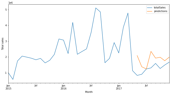
This result is much better than the previous one.
SARIMAX, SARIMA with an exogenous variable
Fit a model
Among the three market values, 10yrBond had the lower p-value. Next, we make use of this 10yrBond.
error_mse, error_rmse, test, f = evaluate_sarimax_model(y,exog=exog1,order=best_odrder1,seasonal_order=best_sesonal_order1)
print('error_mse %.5e, error_rmse %.0f'% (error_mse, error_rmse))
predictions= data_test[[]].copy()
predictions['predictions']=f
# Plot predictions against known values
title =''
ylabel='Total sales'
xlabel='Month'


ax = y.plot(legend=True,figsize=(12,6),title=title)
predictions['predictions'].plot(legend=True)
ax.autoscale(axis='x',tight=True)
ax.set(xlabel=xlabel, ylabel=ylabel);
Grid search
import json

try:

    with open("../data/sarimax.json", 'r') as f:
        best_odrder2, best_sesonal_order2, best_score2 = json.load(f)
except:

    import warnings
    warnings.filterwarnings("ignore")

    best_odrder2, best_sesonal_order2, best_score2 = evaluate_models(y, p_values, d_values, q_values, P_values,D_values,Q_values, m_values)

    with open("../data/sarimax.json", 'w') as f:
        # indent=2 is not needed but makes the file human-readable
        json.dump( [best_odrder2, best_sesonal_order2, best_score2], f)
error_mse, error_rmse, test, f = evaluate_sarimax_model(y,exog=exog1,order=best_odrder2,seasonal_order=best_sesonal_order2,)
print('error_mse %.5e, error_rmse %.0f'% (error_mse, error_rmse))
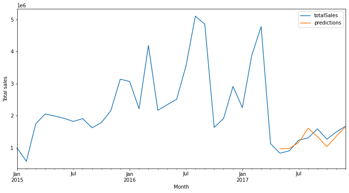
This error is the lowest ever.
ModelComparison = addModel(ModelComparison,'SARIMAX with Grid Search',best_score2,str(best_odrder2)+' '+str(best_sesonal_order2))
ModelComparison
# Refit the model
predictions= data_test[[]].copy()
predictions['predictions']=f
# Plot predictions against known values
title =''
ylabel='Total sales'
xlabel='Month'

ax = y.plot(legend=True,figsize=(12,6),title=title)
predictions['predictions'].plot(legend=True)
ax.autoscale(axis='x',tight=True)
ax.set(xlabel=xlabel, ylabel=ylabel);
Facebeook's Prophet
import pandas as pd
from fbprophet import Prophet
%matplotlib inline
m = Prophet(
#     weekly_seasonality=True,
#     daily_seasonality=True,
    seasonality_mode='multiplicative',
)
m.fit(df_prophet)
future = m.make_future_dataframe(3, freq='MS')
forecast = m.predict(future)
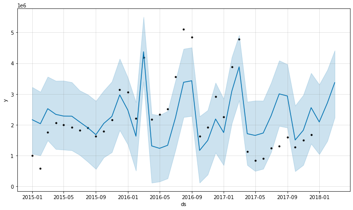
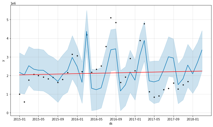
fig = m.plot(forecast);
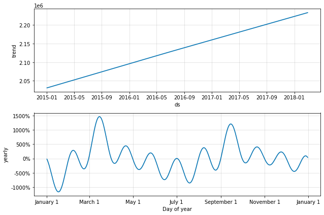
fig = m.plot_components(forecast)
from fbprophet.plot import add_changepoints_to_plot
fig = m.plot(forecast)
a = add_changepoints_to_plot(fig.gca(), m, forecast)
Error Evaluation
Here we calcualte the errors to compare with the others.
len(data_train)
data_test['totalSales']
start=len(data_train)
end=len(data_train)+len(data_test)-1

predictions = forecast.iloc[start:end+1]['yhat']
print('mse %.5e'% (mean_squared_error(predictions,data_test['totalSales'])))
Although the time of preparation and calculation is much faster than the ARIMAX, this score of error was much worse. This may be because the data we used to train the model was too low.
ModelComparison = addModel(ModelComparison,"Facebook's Prophet",mean_squared_error(predictions,data_test['totalSales']),None)
ModelComparison
RNN (Recurrent Neural Network)
Scale Data
from sklearn.preprocessing import MinMaxScaler
scaler = MinMaxScaler()
scaler.fit(y_train)
scaled_train = scaler.transform(y_train)
scaled_test = scaler.transform(y_test)
Time Series Generator
from keras.preprocessing.sequence import TimeseriesGenerator
n_input = 12
n_features=1
generator = TimeseriesGenerator(
    scaled_train,
    scaled_train,
    length=n_input,
    batch_size=1
)
Fit a Model
from keras.models import Sequential
from keras.layers import Dense
from keras.layers import LSTM
# define model
model = Sequential()
model.add(LSTM(150, activation='relu', input_shape=(n_input, n_features)))
model.add(Dense(1)) # Only one predicted result is required.
model.compile(optimizer='adam', loss='mse')
model.summary()
# fit model
model.fit_generator(generator,epochs=100)
model.history.history.keys()
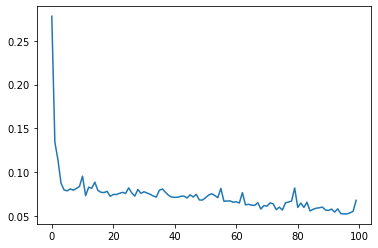
loss_per_epoch = model.history.history['loss']
plt.plot(range(len(loss_per_epoch)),loss_per_epoch)
Evaluate on Test Data¶¶
first_eval_batch = scaled_train[-split:]
first_eval_batch
first_eval_batch = first_eval_batch.reshape((1, split, n_features))
# Generate predictions into the same time stamps as the test set

test_predictions = []

first_eval_batch = scaled_train[-n_input:]
current_batch = first_eval_batch.reshape((1, n_input, n_features))

for i in range(len(y_test)):

    # get prediction 1 time stamp ahead ([0] is for grabbing just the number instead of [array])
    current_pred = model.predict(current_batch)[0]

    # store prediction
    test_predictions.append(current_pred)

    # update batch to now include prediction and drop first value
    current_batch = np.append(current_batch[:,1:,:],[[current_pred]],axis=1)
### Inverse Transformations and Compare
test_predictions
true_predictions = scaler.inverse_transform(test_predictions)
true_predictions
Create a new dataframe that has both the original test values and your predictions for them.
y_test['Predictions'] = true_predictions
test.head()
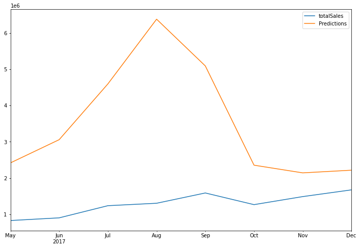
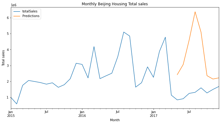
y_test.plot(figsize=(12,8));
# Plot predictions against known values
title ='Monthly Beijing Housing Total sales'
ylabel='Total sales'
xlabel='Month'

ax = y.plot(legend=True,figsize=(12,6),title=title)
y_test['Predictions'].plot(legend=True)
ax.autoscale(axis='x',tight=True)
ax.set(xlabel=xlabel, ylabel=ylabel);
Error Evaluation
print('mse %.5e'% (mean_squared_error(y_test['Predictions'],y_test.iloc[:,0])))
y_test
ModelComparison = addModel(ModelComparison,'RNN',mean_squared_error(y_test['Predictions'],y_test['totalSales']),None)
ModelComparison
Conclusion
Based on ModelComparison, the best model was SARIMAX with Grid Search. Next, we use this model.
Step 06 Two months Forecast
# Make a
model = SARIMAX(y,exog=exog1,order=(2,1,2),seasonal_order=(2,0,1,12),enforce_invertibility=False)
results = model.fit(disp=0)


exog_forecast = market[['10yrBond']].loc['2017-12-31':]
fcast = results.predict(len(y)-1,
                        len(y)+2,
                        exog=exog_forecast[:3]).rename('SARIMAX(2, 1, 2) (2, 0, 1, 12) Forecast')
title='2 months Forecast'
xlabel='Month'
ylabel='Total sales'

ax = y.plot(legend=True,figsize=(16,6),title=title)
fcast.plot(legend=True)
ax.autoscale(axis='x',tight=True)
ax.set(xlabel=xlabel, ylabel=ylabel);
Save the data
market.index.names=['month']
datapath = '../data'
save_file(df, 'df_data_step3b_EDA.csv', datapath)
save_file(market.reset_index(), 'time_sales_data_step3b_EDA.csv', datapath)
