Clustering Case Study: Customer Segmentation with K-Means - Tier 3
This case study is based on this blog post by the yhat blog. Please feel free to refer to the post for additional information, and solutions.
Structure of the mini-project:
- Sourcing and loading
- Load the data
- Explore the data
- Cleaning, transforming and visualizing
- Data Wrangling: Exercise Set 1
- Creating a matrix with a binary indicator for whether they responded to a given offer
- Ensure that in doing so, NAN values are dealt with appropriately
- Data Wrangling: Exercise Set 1
Modelling
K-Means clustering: Exercise Sets 2 and 3
- Choosing K: The Elbow method
- Choosing K: The Silhouette method
- Choosing K: The Gap statistic method
Visualizing clusters with PCA: Exercise Sets 4 and 5
- Conclusions and next steps
- Conclusions
- Other clustering algorithms (Exercise Set 6)
%matplotlib inline
import pandas as pd
import sklearn
import matplotlib.pyplot as plt
import seaborn as sns

# Setup Seaborn
sns.set_style("whitegrid")
sns.set_context("poster")
# Set the number of display
pd.set_option('display.max_columns', 100)
pd.set_option('display.max_rows', 100)
1. Sourcing and loading
1a. Load the data
The dataset contains information on marketing newsletters/e-mail campaigns (e-mail offers sent to customers) and transaction level data from customers. The transactional data shows which offer customers responded to, and what the customer ended up buying. The data is presented as an Excel workbook containing two worksheets. Each worksheet contains a different dataset.
df_offers = pd.read_excel("./WineKMC.xlsx", sheet_name=0)
1b. Explore the data
df_offers.columns = ["offer_id", "campaign", "varietal", "min_qty", "discount", "origin", "past_peak"]
df_offers.head()
We see that the first dataset contains information about each offer such as the month it is in effect and several attributes about the wine that the offer refers to: the variety, minimum quantity, discount, country of origin and whether or not it is past peak. The second dataset in the second worksheet contains transactional data -- which offer each customer responded to.
df_transactions = pd.read_excel("./WineKMC.xlsx", sheet_name=1)
df_transactions.columns = ["customer_name", "offer_id"]
df_transactions['n'] = 1
df_transactions.head()
We're trying to learn more about how our customers behave, so we can use their behavior (whether or not they purchased something based on an offer) as a way to group similar minded customers together. We can then study those groups to look for patterns and trends which can help us formulate future offers.
The first thing we need is a way to compare customers. To do this, we're going to create a matrix that contains each customer and a 0/1 indicator for whether or not they responded to a given offer.
Checkup Exercise Set I
Exercise: Create a data frame where each row has the following columns (Use the pandas [`merge`]) and [`pivot_table`] functions for this purpose):
- customer_name
- One column for each offer, with a 1 if the customer responded to the offer
Make sure you also deal with any weird values such as `NaN`. Read the documentation to develop your solution.
#your turn
df = df_transactions.merge(df_offers,on='offer_id',how='left').drop(['campaign'],axis=1)
df.head()
df.describe()
import numpy as np
pivoted = df.pivot_table(
    values='n',
    index='customer_name',
    columns='offer_id',
    fill_value=0,
    aggfunc = np.sum)
pivoted.head()
3. Modelling
3a. K-Means Clustering
Recall that in K-Means Clustering we want to maximize the distance between centroids and minimize the distance between data points and the respective centroid for the cluster they are in. True evaluation for unsupervised learning would require labeled data; however, we can use a variety of intuitive metrics to try to pick the number of clusters K. We will introduce two methods: the Elbow method, the Silhouette method and the gap statistic.
3ai. Choosing K: The Elbow Sum-of-Squares Method
The first method looks at the sum-of-squares error in each cluster against $K$. We compute the distance from each data point to the center of the cluster (centroid) to which the data point was assigned.
$$SS = \sum_k \sum_{x_i \in C_k} \sum_{x_j \in C_k} \left( x_i - x_j \right)^2 = \sum_k \sum_{x_i \in C_k} \left( x_i - \mu_k \right)^2$$where $x_i$ is a point, $C_k$ represents cluster $k$ and $\mu_k$ is the centroid for cluster $k$. We can plot SS vs. $K$ and choose the elbow point in the plot as the best value for $K$. The elbow point is the point at which the plot starts descending much more slowly.
Hint: the Elbow Method is discussed in part 2 of the Harvard Clustering lecture.
Checkup Exercise Set II
Exercise:
- 1. What values of $SS$ do you believe represent better clusterings? Why?
- 2. Create a numpy matrix `x_cols` with only the columns representing the offers (i.e. the 0/1 colums)
- 3. Write code that applies the [`KMeans`] clustering method from scikit-learn to this matrix.
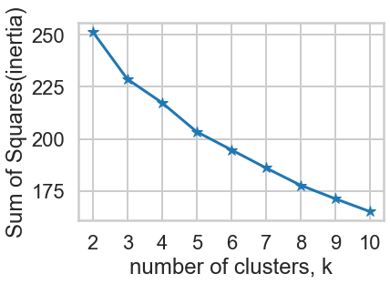
- 4. Construct a plot showing $SS$ for each $K$ and pick $K$ using this plot. For simplicity, test $2 \le K \le 10$.
- 5. Make a bar chart showing the number of points in each cluster for k-means under the best $K$.
- 6. What challenges did you experience using the Elbow method to pick $K$?
# 2. a numpy matrix `x_cols` with only the columns representing the offers
X = pivoted.to_numpy()
# 3. Write code that applies the [`KMeans`] clustering method
# from scikit-learn to this matrix.

# 4. Construct a plot showing  𝑆𝑆  for each  𝐾
# and pick  𝐾  using this plot.
# For simplicity, test  2≤𝐾≤10 .

from sklearn.cluster import KMeans


ks = range(2, 11)
inertias = []

for k in ks:
    # Create a KMeans instance with k clusters: model
    model = KMeans(n_clusters = k,random_state=10)

    # Fit a new model to samples
    model.fit(X)

    # Append the SS(inertia) to the list of inertias
    inertias.append(model.inertia_)

# Plot ks vs inertias
plt.plot(ks, inertias, '-*')
plt.xlabel('number of clusters, k')
plt.ylabel('Sum of Squares(inertia)')
plt.xticks(ks)
plt.show()
According to the SS graph, K=10 is the best K.
# 5. Make a bar chart showing the number of points in each cluster
# for k-means under the best  𝐾 .

# Set the best K and fit a model
best_K = 10
model = KMeans(n_clusters = best_K,random_state=42)
model.fit(X)

counts = np.bincount(model.labels_)

# Print plt.bar
plt.bar(range(best_K), counts);
plt.xlabel("Cluster ID")
plt.ylabel("Count")
plt.xticks(range(best_K))
plt.show()
6. What challenges did you experience using the Elbow method to pick 𝐾 ?
Choosing the best K number manually is difficult as it is difficult to define a reasnoable quantitative criteria to judge if the K is good or not, and after all it is human sense, which will vary from time to time.
3aii. Choosing K: The Silhouette Method
There exists another method that measures how well each datapoint $x_i$ "fits" its assigned cluster and also how poorly it fits into other clusters. This is a different way of looking at the same objective. Denote $a_{x_i}$ as the average distance from $x_i$ to all other points within its own cluster $k$. The lower the value, the better. On the other hand $b_{x_i}$ is the minimum average distance from $x_i$ to points in a different cluster, minimized over clusters. That is, compute separately for each cluster the average distance from $x_i$ to the points within that cluster, and then take the minimum. The silhouette $s(x_i)$ is defined as
$$s(x_i) = \frac{b_{x_i} - a_{x_i}}{\max{\left( a_{x_i}, b_{x_i}\right)}}$$The silhouette score is computed on every datapoint in every cluster. The silhouette score ranges from -1 (a poor clustering) to +1 (a very dense clustering) with 0 denoting the situation where clusters overlap. Some criteria for the silhouette coefficient is provided in the table below.
| Range | Interpretation |
|---|---|
| 0.71 - 1.0 | A strong structure has been found. |
| 0.51 - 0.7 | A reasonable structure has been found. |
| 0.26 - 0.5 | The structure is weak and could be artificial. |
| < 0.25 | No substantial structure has been found. |
</pre> Source: http://www.stat.berkeley.edu/~spector/s133/Clus.html
Hint: Scikit-learn provides a function to compute this for us (phew!) called sklearn.metrics.silhouette_score. Take a look at this article on picking $K$ in scikit-learn, as it will help you in the next exercise set.
Checkup Exercise Set III
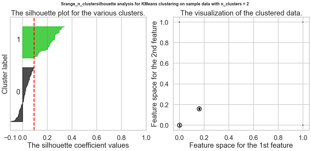
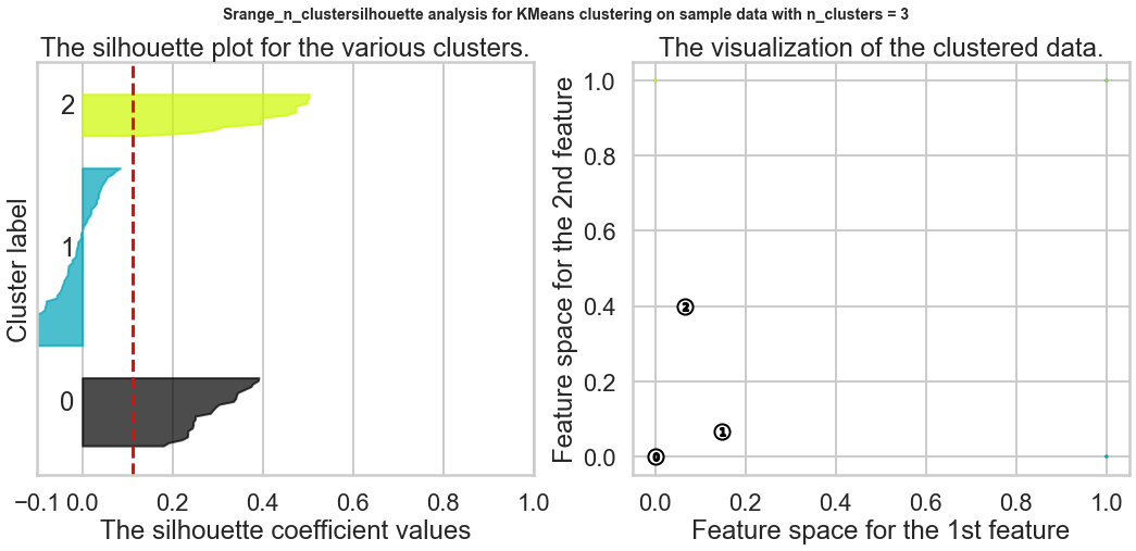
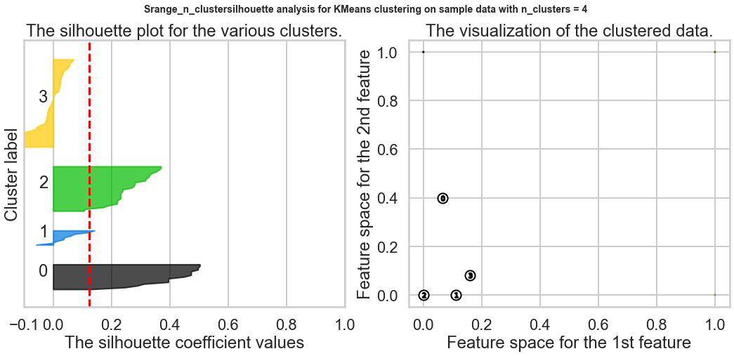
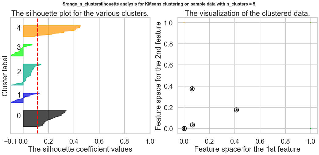
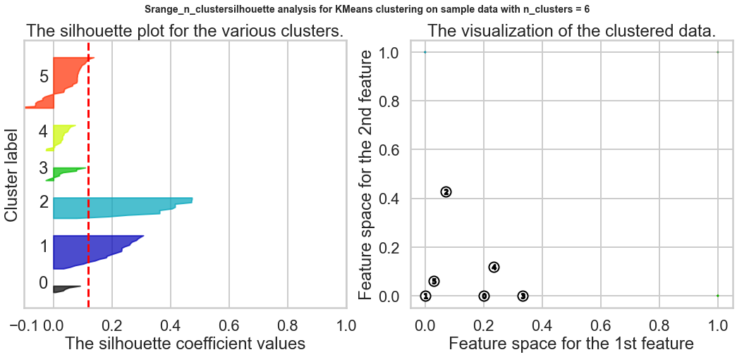
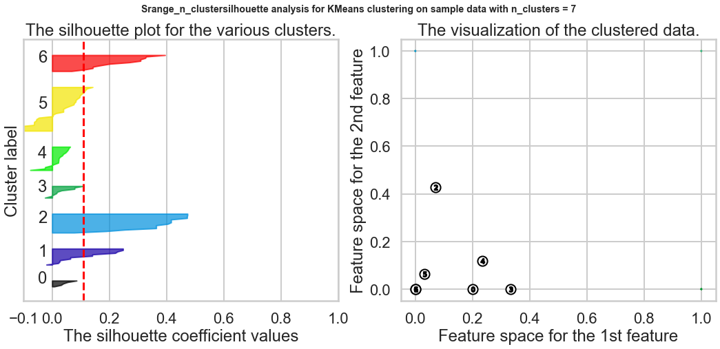
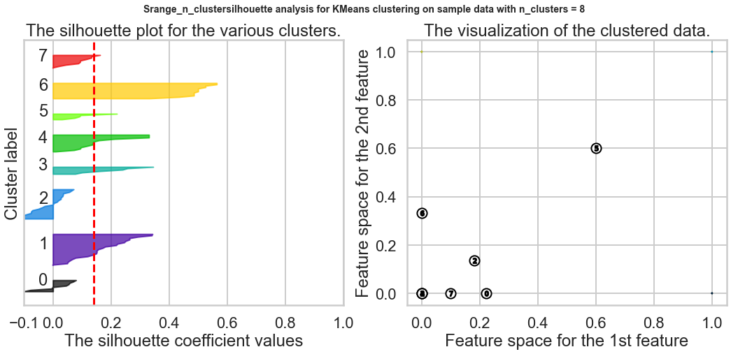
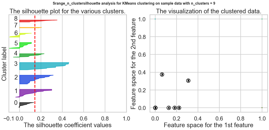
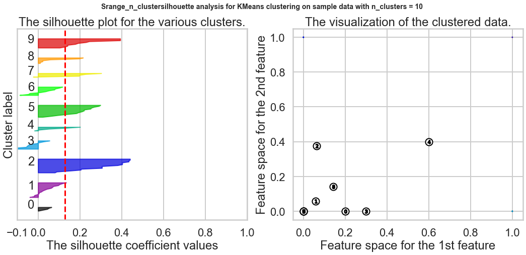
Exercise1: Using the documentation for the `silhouette_score` function above, construct a series of silhouette plots like the ones in the article linked above.
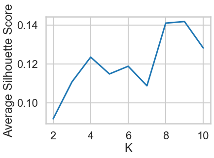
Exercise2: Compute the average silhouette score for each $K$ and plot it. What $K$ does the plot suggest we should choose? Does it differ from what we found using the Elbow method?
# Your turn.
# 1.Using the documentation for the `silhouette_score` function above,
# construct a series of silhouette plots
# like the ones in the article linked above.
from sklearn.metrics import silhouette_samples, silhouette_score

import matplotlib.pyplot as plt
import matplotlib.cm as cm
import numpy as np

range_n_clusters = range(2, 11)

ave_silhouette_score = []

for n_clusters in range_n_clusters:
    # Create a subplot with 1 row and 2 columns
    fig, (ax1, ax2) = plt.subplots(1, 2)
    fig.set_size_inches(18, 7)

    # The 1st subplot is the silhouette plot
    # The silhouette coefficient can range from -1, 1 but in this example all
    # lie within [-0.1, 1]
    ax1.set_xlim([-0.1, 1])
    # The (n_clusters+1)*10 is for inserting blank space between silhouette
    # plots of individual clusters, to demarcate them clearly.
    ax1.set_ylim([0, len(X) + (n_clusters + 1) * 10])

    # Initialize the clusterer with n_clusters value and a random generator
    # seed of 10 for reproducibility.
    clusterer = KMeans(n_clusters=n_clusters, random_state=10)
    cluster_labels = clusterer.fit_predict(X)

    # The silhouette_score gives the average value for all the samples.
    # This gives a perspective into the density and separation of the formed
    # clusters
    silhouette_avg = silhouette_score(X, cluster_labels)
    print("For n_clusters =", n_clusters,
          "The average silhouette_score is :", silhouette_avg)

    # Add the silhouette average to the list
    ave_silhouette_score.append(silhouette_avg)

    # Compute the silhouette scores for each sample
    sample_silhouette_values = silhouette_samples(X, cluster_labels)

    y_lower = 10
    for i in range(n_clusters):
        # Aggregate the silhouette scores for samples belonging to
        # cluster i, and sort them
        ith_cluster_silhouette_values = \
            sample_silhouette_values[cluster_labels == i]

        ith_cluster_silhouette_values.sort()

        size_cluster_i = ith_cluster_silhouette_values.shape[0]
        y_upper = y_lower + size_cluster_i

        color = cm.nipy_spectral(float(i) / n_clusters)
        ax1.fill_betweenx(np.arange(y_lower, y_upper),
                          0, ith_cluster_silhouette_values,
                          facecolor=color, edgecolor=color, alpha=0.7)

        # Label the silhouette plots with their cluster numbers at the middle
        ax1.text(-0.05, y_lower + 0.5 * size_cluster_i, str(i))

        # Compute the new y_lower for next plot
        y_lower = y_upper + 10  # 10 for the 0 samples

    ax1.set_title("The silhouette plot for the various clusters.")
    ax1.set_xlabel("The silhouette coefficient values")
    ax1.set_ylabel("Cluster label")

    # The vertical line for average silhouette score of all the values
    ax1.axvline(x=silhouette_avg, color="red", linestyle="--")

    ax1.set_yticks([])  # Clear the yaxis labels / ticks
    ax1.set_xticks([-0.1, 0, 0.2, 0.4, 0.6, 0.8, 1])

    # 2nd Plot showing the actual clusters formed
    colors = cm.nipy_spectral(cluster_labels.astype(float) / n_clusters)
    ax2.scatter(X[:, 0], X[:, 1], marker='.', s=30, lw=0, alpha=0.7,
                c=colors, edgecolor='k')

    # Labeling the clusters
    centers = clusterer.cluster_centers_
    # Draw white circles at cluster centers
    ax2.scatter(centers[:, 0], centers[:, 1], marker='o',
                c="white", alpha=1, s=200, edgecolor='k')

    for i, c in enumerate(centers):
        ax2.scatter(c[0], c[1], marker='$%d$' % i, alpha=1,
                    s=50, edgecolor='k')

    ax2.set_title("The visualization of the clustered data.")
    ax2.set_xlabel("Feature space for the 1st feature")
    ax2.set_ylabel("Feature space for the 2nd feature")

    plt.suptitle(("Srange_n_clustersilhouette analysis for KMeans clustering on sample data "
                  "with n_clusters = %d" % n_clusters),
                 fontsize=14, fontweight='bold')

plt.show()

plt.plot(range_n_clusters,ave_silhouette_score)
plt.xlabel("K")
plt.ylabel("Average Silhouette Score")

plt.show()
2.Compute the average silhouette score for each 𝐾 and plot it. What 𝐾 does the plot suggest we should choose? Does it differ from what we found using the Elbow method?
Based on the chart, the best K is 9, and this result is different from what we found in the Elbow method.
3aiii. Choosing $K$: The Gap Statistic
There is one last method worth covering for picking $K$, the so-called Gap statistic. The computation for the gap statistic builds on the sum-of-squares established in the Elbow method discussion, and compares it to the sum-of-squares of a "null distribution," that is, a random set of points with no clustering. The estimate for the optimal number of clusters $K$ is the value for which $\log{SS}$ falls the farthest below that of the reference distribution:
$$G_k = E_n^*\{\log SS_k\} - \log SS_k$$In other words a good clustering yields a much larger difference between the reference distribution and the clustered data. The reference distribution is a Monte Carlo (randomization) procedure that constructs $B$ random distributions of points within the bounding box (limits) of the original data and then applies K-means to this synthetic distribution of data points.. $E_n^*\{\log SS_k\}$ is just the average $SS_k$ over all $B$ replicates. We then compute the standard deviation $\sigma_{SS}$ of the values of $SS_k$ computed from the $B$ replicates of the reference distribution and compute
$$s_k = \sqrt{1+1/B}\sigma_{SS}$$Finally, we choose $K=k$ such that $G_k \geq G_{k+1} - s_{k+1}$.
Aside: Choosing $K$ when we Have Labels
Unsupervised learning expects that we do not have the labels. In some situations, we may wish to cluster data that is labeled. Computing the optimal number of clusters is much easier if we have access to labels. There are several methods available. We will not go into the math or details since it is rare to have access to the labels, but we provide the names and references of these measures.
- Adjusted Rand Index
- Mutual Information
- V-Measure
- Fowlkes–Mallows index
Hint: See this article for more information about these metrics.
3b. Visualizing Clusters using PCA
How do we visualize clusters? If we only had two features, we could likely plot the data as is. But we have 100 data points each containing 32 features (dimensions). Principal Component Analysis (PCA) will help us reduce the dimensionality of our data from 32 to something lower. For a visualization on the coordinate plane, we will use 2 dimensions. In this exercise, we're going to use it to transform our multi-dimensional dataset into a 2 dimensional dataset.
This is only one use of PCA for dimension reduction. We can also use PCA when we want to perform regression but we have a set of highly correlated variables. PCA untangles these correlations into a smaller number of features/predictors all of which are orthogonal (not correlated). PCA is also used to reduce a large set of variables into a much smaller one.
Hint: PCA was discussed in the previous subunit. If you need help with it, consult this useful article and this visual explanation.
Checkup Exercise Set IV
Exercise1: Use PCA to plot your clusters:
- 1.Use scikit-learn's [`PCA`](http://scikit-learn.org/stable/modules/generated/sklearn.decomposition.PCA.html) function to reduce the dimensionality of your clustering data to 2 components
- 2.Create a data frame with the following fields:
- customer name
- cluster id the customer belongs to
- the two PCA components (label them `x` and `y`)
- 3.Plot a scatterplot of the `x` vs `y` columns
- 4.Color-code points differently based on cluster ID
- 5.How do the clusters look?
- 6.Based on what you see, what seems to be the best value for $K$? Moreover, which method of choosing $K$ seems to have produced the optimal result visually?
Exercise2: Now look at both the original raw data about the offers and transactions and look at the fitted clusters. Tell a story about the clusters in context of the original data. For example, do the clusters correspond to wine variants or something else interesting?
#your turn
# 1.1, 1.2
from sklearn.decomposition import PCA

pca = PCA(n_components=2)
pca.fit(X)
X_pca = pca.transform(X)

X_pca = pd.DataFrame(X_pca,columns='x y'.split())
X_pca.head()
# 1.3, 1.4
# The label to use is from 3a.K-Means Clustering with K=10 by Elbow method.
import matplotlib.colors

best_K = 10
model = KMeans(n_clusters = best_K,random_state=42)
model.fit(X)

cmap = matplotlib.colors.ListedColormap(['red', 'green', 'blue'])
plt.scatter(X_pca.x,X_pca.y,c=model.labels_,cmap=cmap);

plt.xlabel('PCA1')
plt.ylabel('PCA2')
plt.show()
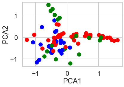
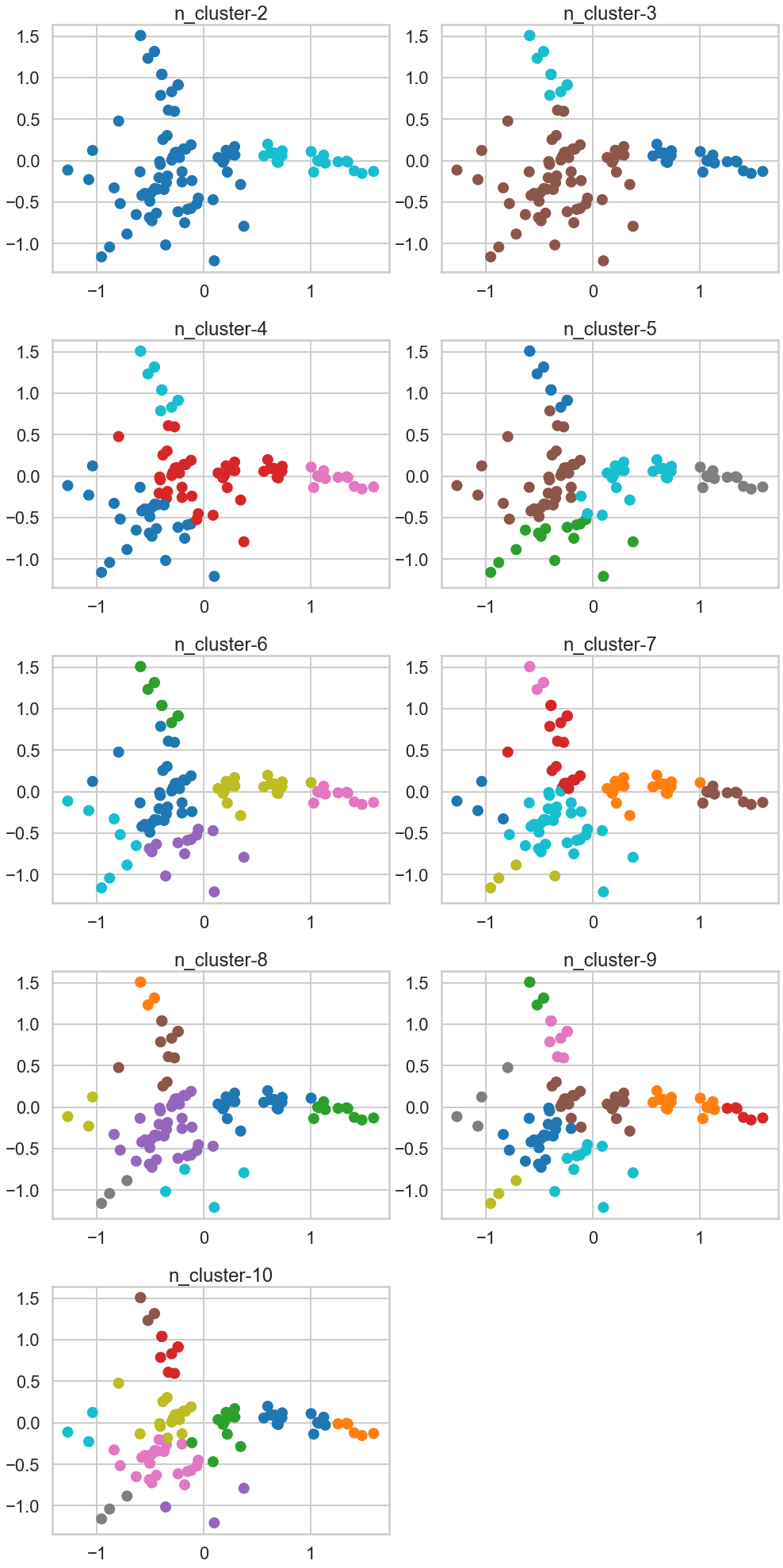
1.5 How do the clusters look?, 1.6 Based on what you see, what seems to be the best value for 𝐾 ? Moreover, which method of choosing 𝐾 seems to have produced the optimal result visually?
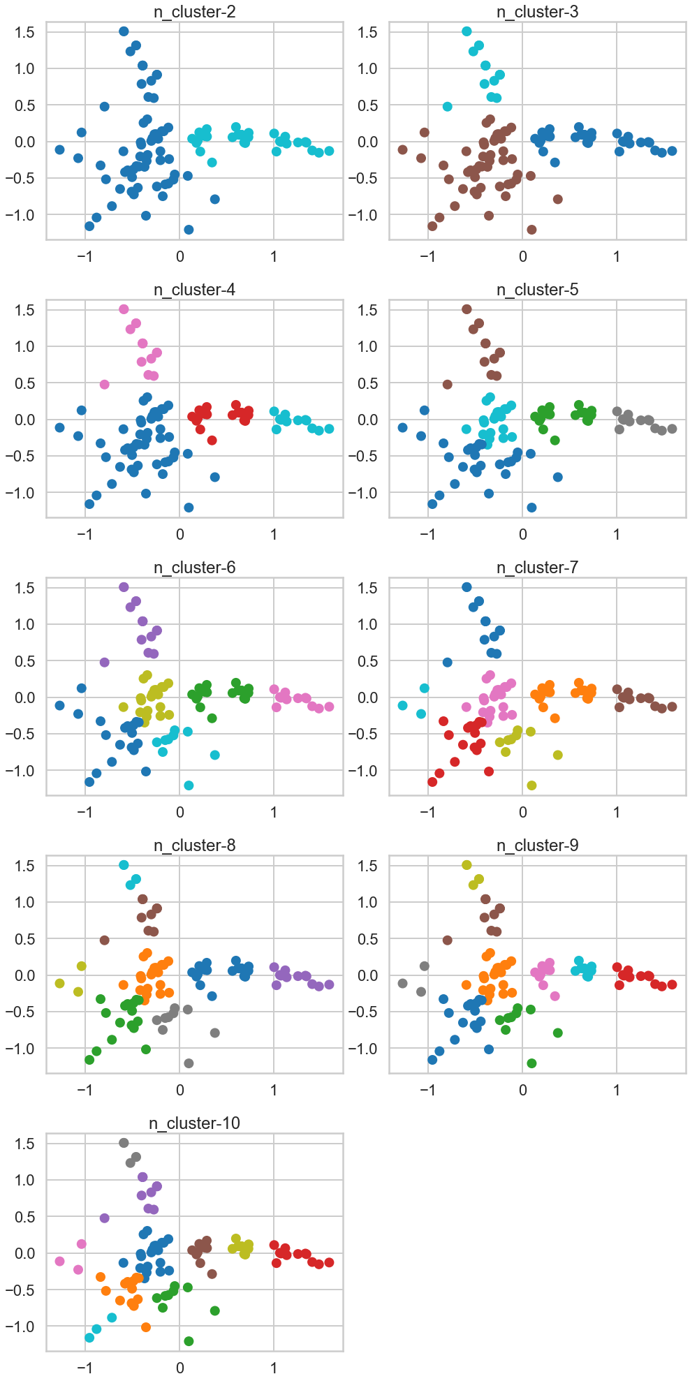
The cluster looks more visible. Based on this two PCA components, the number of clusters looks minimum three as blue and green cluster is well explained, and the red is the remaining, but the number of. cluster seems upto seven to eight by my visual check.
When it comes to find the Best K visually, PCA method seems the best because unlike Elbow method or the other method, we can eyeball-check the data distribution more clearly.
2 Now look at both the original raw data about the offers and transactions and look at the fitted clusters. Tell a story about the clusters in context of the original data. For example, do the clusters correspond to wine variants or something else interesting?
# K we use here is 3
n_clusters=3
model = sklearn.cluster.KMeans(n_clusters=n_clusters,random_state=42)
cluster_assignments = model.fit_predict(X)

# Visualise wine variants vs cluster
df2 = pivoted.copy()
df2['cluster'] = model.labels_

df1 = df.merge(df2[['cluster']],on='customer_name',how='left')
df1[['cluster']] = df1[['cluster']].astype('category')
df1[['offer_id']] = df1[['offer_id']].astype('category')
df1.head()
# Plot the #clusters per wine variants and purchase
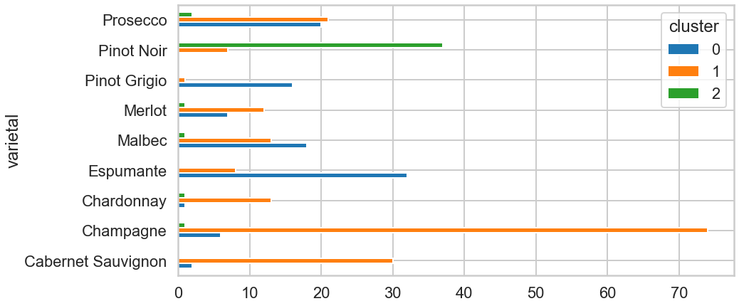
df1.pivot_table(index=['varietal'],columns='cluster',aggfunc='size').plot(kind='barh',figsize=(14,7));
Based on this chart, there seem to be a relationship between a choice of vine and clusters. The clients who chose the first left three varietals seem more likely to be clustered into 0. Others who chose Espumante, Pinot Grigio seems likely to be into cluster 1, and the others who chose Pinot Noir looks 2.
# Plot the #origins per origin and purchase
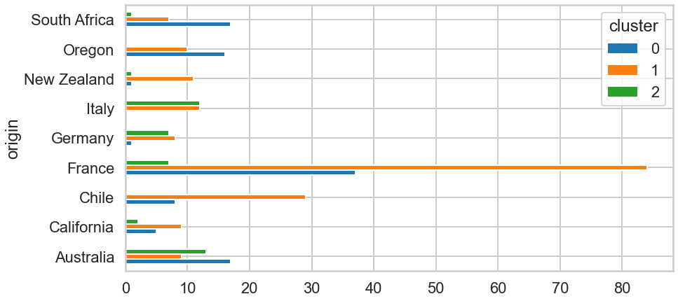
df1.pivot_table(index=['origin'],columns='cluster',aggfunc='size').plot(kind='barh',figsize=(14,7));
Looking at the purely frequency, people whose origin is France bought by far the most. Overall, we can recognise some variance in the number of of origin and purchase.
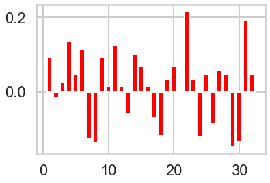
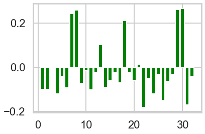
# Plot count of offer_id in each cluster vs globally.

n_clusters=3
model = sklearn.cluster.KMeans(n_clusters=n_clusters)
cluster_assignments = model.fit_predict(X)

colors = ['red', 'green', 'blue']
offer_proportions = X.sum(axis=0) / 100  # There are 100 customers

for i in range(n_clusters):
    plt.figure(i)
    cluster = X[cluster_assignments == i]
    offer_proportions_cluster = cluster.sum(axis=0) / cluster.shape[0]  # Number of customers in cluster
    lift = offer_proportions_cluster - offer_proportions
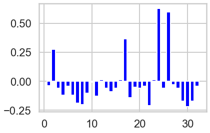
    plt.bar(range(1, 33), lift, color = colors[i])
Summary
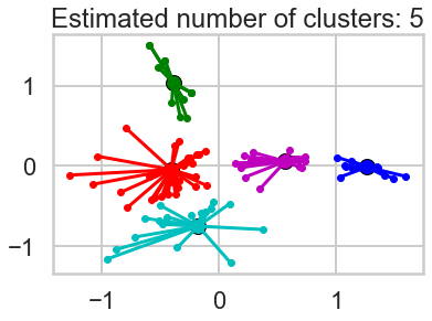
What we've done is we've taken those columns of 0/1 indicator variables, and we've transformed them into a 2-D dataset. We took one column and arbitrarily called it x and then called the other y. Now we can throw each point into a scatterplot. We color coded each point based on it's cluster so it's easier to see them.
Exercise Set V
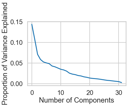
As we saw earlier, PCA has a lot of other uses. Since we wanted to visualize our data in 2 dimensions, restricted the number of dimensions to 2 in PCA. But what is the true optimal number of dimensions?
Exercise: Using a new PCA object shown in the next cell, plot the `explained_variance_` field and look for the elbow point, the point where the curve's rate of descent seems to slow sharply. This value is one possible value for the optimal number of dimensions. What is it?
#your turn
# Initialize a new PCA model with a default number of components.
import sklearn.decomposition
pca = sklearn.decomposition.PCA()
pca.fit(X)

# Do the rest on your own :)
variance = pca.explained_variance_ratio_

# Plot() it
plt.plot(range(len(variance)), variance)

# Label the axes
plt.xlabel("Number of Components")
plt.ylabel("Proportion of Variance Explained")
4b. Other clustering algorithms
k-means is only one of a ton of clustering algorithms. Below is a brief description of several clustering algorithms, and the table provides references to the other clustering algorithms in scikit-learn.
Affinity Propagation does not require the number of clusters $K$ to be known in advance! AP uses a "message passing" paradigm to cluster points based on their similarity.
Spectral Clustering uses the eigenvalues of a similarity matrix to reduce the dimensionality of the data before clustering in a lower dimensional space. This is tangentially similar to what we did to visualize k-means clusters using PCA. The number of clusters must be known a priori.
Ward's Method applies to hierarchical clustering. Hierarchical clustering algorithms take a set of data and successively divide the observations into more and more clusters at each layer of the hierarchy. Ward's method is used to determine when two clusters in the hierarchy should be combined into one. It is basically an extension of hierarchical clustering. Hierarchical clustering is divisive, that is, all observations are part of the same cluster at first, and at each successive iteration, the clusters are made smaller and smaller. With hierarchical clustering, a hierarchy is constructed, and there is not really the concept of "number of clusters." The number of clusters simply determines how low or how high in the hierarchy we reference and can be determined empirically or by looking at the dendogram.
Agglomerative Clustering is similar to hierarchical clustering but but is not divisive, it is agglomerative. That is, every observation is placed into its own cluster and at each iteration or level or the hierarchy, observations are merged into fewer and fewer clusters until convergence. Similar to hierarchical clustering, the constructed hierarchy contains all possible numbers of clusters and it is up to the analyst to pick the number by reviewing statistics or the dendogram.
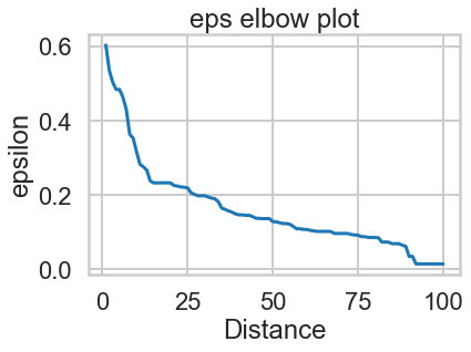
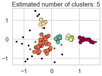
DBSCAN is based on point density rather than distance. It groups together points with many nearby neighbors. DBSCAN is one of the most cited algorithms in the literature. It does not require knowing the number of clusters a priori, but does require specifying the neighborhood size.
Clustering Algorithms in Scikit-learn
| Method name | Parameters | Scalability | Use Case | Geometry (metric used) | </tr> </thead>
|---|---|---|---|---|
| K-Means | number of clusters | Very largen_samples, medium n_clusters with MiniBatch code | General-purpose, even cluster size, flat geometry, not too many clusters | Distances between points | </tr>
| Affinity propagation | damping, sample preference | Not scalable with n_samples | Many clusters, uneven cluster size, non-flat geometry | Graph distance (e.g. nearest-neighbor graph) | </tr>
| Mean-shift | bandwidth | Not scalable with n_samples | Many clusters, uneven cluster size, non-flat geometry | Distances between points | </tr>
| Spectral clustering | number of clusters | Medium n_samples, small n_clusters | Few clusters, even cluster size, non-flat geometry | Graph distance (e.g. nearest-neighbor graph) | </tr>
| Ward hierarchical clustering | number of clusters | Large n_samples and n_clusters | Many clusters, possibly connectivity constraints | Distances between points | </tr>
| Agglomerative clustering | number of clusters, linkage type, distance | Large n_samples and n_clusters | Many clusters, possibly connectivity constraints, non Euclidean distances | Any pairwise distance | </tr>
| DBSCAN | neighborhood size | Very large n_samples, medium n_clusters | Non-flat geometry, uneven cluster sizes | Distances between nearest points | </tr>
| Gaussian mixtures | many | Not scalable | Flat geometry, good for density estimation | Mahalanobis distances to centers | </tr>
| Birch | branching factor, threshold, optional global clusterer. | Large n_clusters and n_samples | Large dataset, outlier removal, data reduction. | Euclidean distance between points | </tr> </tbody> </table> Source: http://scikit-learn.org/stable/modules/clustering.html
